We are very interested in your background. What opportunity opened up your career as a designer?
Jinkui Zhou: I was born in an artistic family. I have been trained in painting and eceie art euc since I c hold a pen.
Later, my interest to design. Part of the reason was that I didn’t want to be a ul artist. Traditional painting was a bit deadend for me, so I wanted to learn newer ehs o creating vision. I think the designer looks happier and less stressed. I dropped out of college and went to the UK to study for 3 years. I learned how to be a concept-oriented designer at CSM(Center Saint Martins College of Art & Design). After returning to China, I worked in coporate for a while and started to e a freelance designer.
How would you describe your design style? Please also introduce your evolution stylistically?
I don’t specifically look for a certain style, I just versed myself in and gave feedback on the image styles I’m interested in. I change my style preferences time to time, and am always learn and try to create something new. Sometimes I combine several styles to create a new one. The things I learn also quite diverse it can be anything from ancient civilization to popular animation.
 Graphic design for Phire wire, GR8, Tokyo
 Typeface design for Tunica Magazine,US
You once said that your design is a “future” style. Can you tell me more about how you describe and imagine the future through design and visual art?
This is nonsense. I refute ths igt h o. Some people think that my style is “Y2K”. Y2K is a bit like saying that my technique is retro saying I just didn’t do it well enough in capturing ture te ture. But I think what I am doing is a new undertaking. I imagine that the future will be a kind of visual feedback just like the present – hybridizing, updating, and upgrading the existing visual system. Each link can be different and the personality will be more detailed. It’s like pinching a character’s face, so it’s harder to define a name. For example, the patterns from the natural world are hybridized with metal fonts and then simplified to become more futuristic technological sens, and this design is used as a symbol for a ei underworld 2080. There is no olly new visual language in the design field unless it is machine-generated or from an alien.
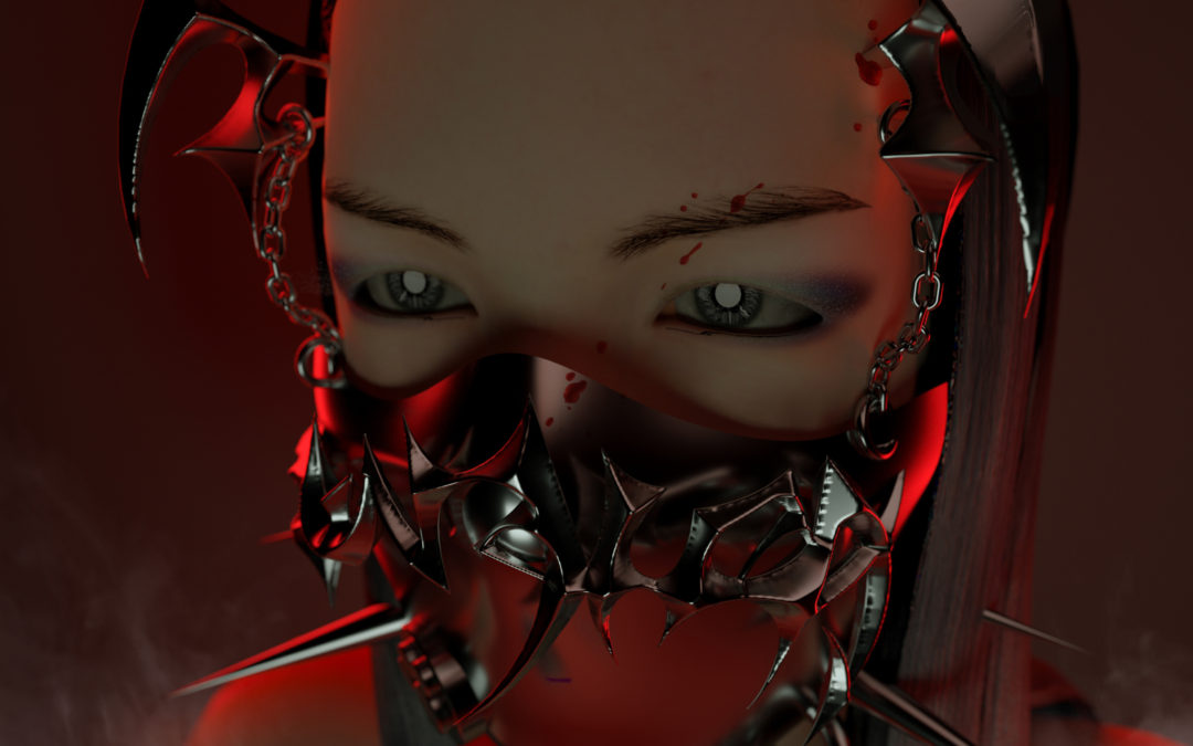
Filter mask “突尼卡”designed for @tunicastudio in collabration with 3D artist @chillchillshit
Digital technology is a driving force that cannot be ignored. I start to add other technologies to my design, such as 3D, AR, VR, and more. When new technologies came out, I would think about how to combine them in, which also change my design in to a certain extent. For example, I designed an Instagram filter last year. There are also some interesting low-tech attempts, such as making patterns in the Logo editor of GTA games.
I may not be able to predict the future but can only follow the development and changes of the times. It’s hard to say what the design of the future will look like, and the demand then will be different from the present.

A large number of your designs are related to club culture and local electronic music scenes in China. Tell us about your experience and perception of participating in club scene as a designer.
Cooperation is a two-way street.
Music gives people a lot of imagination, and it is very personal, it can be particularly dark or infinitely ue innocent and cute. The design fee given by the label is often not high. The unspoken rule is that there is no modification, and the degree of freedom is super high. After finishing it, it can be released to the young people immediately. It is very cool. There is no commercial clients, only artists and viewers. I also often watch the visuals made by other artists for lub and get inspirations.
On the other hand, a good poster can e a party sell more tickets, can support my favorite labels, musicians, and venues. A good VJ can also enhance the party experience, and then I feel all the visuals I made are tly worthy.
 OIL 3 Year Anniversary Merch =͟͟͞͞由 Club Kid Starter Pack x Jinkui Zhou
Speaking of designing posters for music labels, how do you use visual elements, especially font design, to show the concept of a party?
I usually doing it while listening to the music of the musicians in the lineup. It’s very relaxed and unconscious. If it’s suitable, I’ll add visual materials I’m interested in recently, for example after watching fictional alien fonts for three hours I will have some ideas. To transform my feeling or sense into a typography shape is actually quite abstract process.
What is the acceptance of underground style in a broad sense in mainstream commercial design? As an underground designer, how do you view your relationship with the mainstream?
The acceptance of this style in China is not high. Typical requests from clients are like: I like your design very, but can it be alternative? To serve the client, the designer can only actively weaken the visual dynamism, and the concept cannot be too freespirit. I generally work with commercial clients who don’t make such requests. Most of them come from the fashion and music industries. I think commercial clients eci aesthetic, especially when their audience is young people. But this kind of education certainly does not come from the meager power of designers, it mainly come from mainstream media and high-end brands. Because being avant-garde is not a problem, an authority with artistic perception is needed to tell them this is feasible.
I worked at Dazed China for a short period of time. At that time, I made the 3D surround fonts for Mizuhara Kiko, and some of my clients still mention about it for their reference nowadays. They trust influential cases and designers with hard resumes that are piled up by big cases. If an underground designer really wants to change the game, he needs cooperate more with big brands with open aesthetics. This path is not easy. You need post more works and socialize more.
My current relationship with the mainstream is weak. I occasionally rely on that to make money, but my ambition is to gain the right to speak in the mainstream.

Typeface “KIKO”designed for Mizuhara Kiko & Dazed China
What kind of work are you doing recently? What is your role in the agency 88kitties that you co-founded?
Not long ago, I designed a merch set for the 3rd anniversary of OIL Club in Shenzhen. Recently, I am doing some 3D directing work, some of which are commercial brands and musicians. There are also some confidential items.
I founded 88Kitties with two other friends. The characters have changed a lot, but the main thing is to produce concepts and visual ideas, and also do some design and directin.
The concept behind this company is to combine subculture and business, cee new visions, change the rules of the game, expand the influence of underground culture, and monetize it.
logo design @jinkuizhou
sound @rui_hooo
CGI @yiiten
art direction @x1u.x1u

